How Bel Brands USA modernized the look of Merkts Cheese Spread to entice next-gen consumers yet keep loyalists
Brand experts reinvigorate an iconic spreadable cheese brand with Midwestern roots and boost sales.
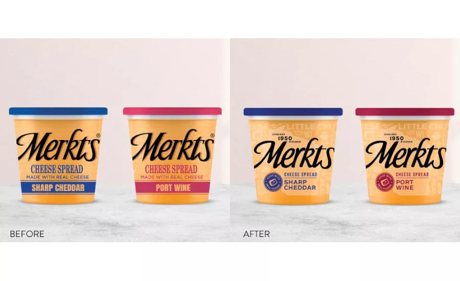
A before-after graphic shows the winning design as developed by the team and picked by consumers. Photo courtesy of Bel Brands USA.
In 2020, Bel Brands USA’s eponymous cheese spread, Merkts, marked 70 years as a consumer staple. Especially for people in the Upper Midwest, serving Merkts Cheese Spread has been a long-standing tradition at barbecues, tailgates, and picnics. Despite consumers’ appetite and nostalgia for Merkts spreadable cheese, the Little Chute, Wis.-based brand faced challenges.
Over the years, Merkts success spurred competitors to enter the market. Consequently, competitors’ packaging often imitated Merkts brand on the shelf. While the pandemic wasn’t the catalyst for the brand’s challenges, as consumers made more trips to the grocery store, Merkts aimed to make its cheese spread stand out from other brands.
“One of our top challenges was reinvigorating Merkts for a new age group without losing the loyalty of older generations,” said Michael Averbook, brand manager for Bel Brands USA, Chicago. “Product loyalty is incredibly valuable, and we couldn’t risk confusing Merkts’ core buyers.”
According to Averbook, the company’s strategy would take equal parts creativity and consistency. While Bel Brands USA has a national footprint, Merkts Cheese Spread is a regional brand. So, an added hurdle was the new packaging wouldn’t have the luxury of a big advertising campaign to educate, inform and drive awareness among consumers. That raised the stakes by asking product managers to shoulder the responsibility for attracting the attention of consumers.
Judging a spread by its cover
Merkts’ product team and external branding experts from Chicago-based marketing and growth consultancy Bluedog Design settled on a redesign of the cheese spread’s packaging. The product itself would remain the same. To judge the success of the strategic branding project, once the redesigned packaging hit stores, the team would look at dollar and volume sales as well as distribution numbers and unit velocity.
In the summer of 2020, the product and branding team set about gathering consumer insights, in part, to inform its new design for packaging Merkts Cheese Spread. As the team considered Merkts’ graphic assets, history, traditions, and the ways consumers served and consumed the product, various designs took shape. The team also experimented with how its revised designs would look with different flavors of the cheese spread, of which there are five including Sharp Cheddar, Port Wine, and Almond Swiss.
“We considered packaging concepts that leaned into a fully retrospective vibe as well as modern twists,” said Leah Olson, director of Growth Strategy for Bluedog Design. “But a focal point was the notion that the rebranding wasn’t about reinvention.”

— Michael Averbook, brand manager for Bel Brands USA, Chicago
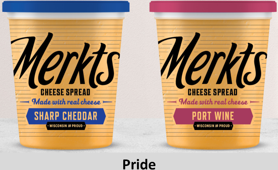
Eventually, the design team arrived at three new packaging concepts dubbed “Pride,” “Bullseye,” and “Stand Out” to compare with the current labeling. Bel Brands USA shared these designs with a battery of 500 pre-screened consumers. Survey respondents confirmed what Averbook and his team felt about the current design by stating it was outdated.
Consumers said Bullseye had a premium look, but they didn’t like it. The Pride packaging was noted for being modern but also plain. Ninety-seven percent of users and 76% of non-users voted for the Stand Out design, more than any of the other options. Stand Out’s design elements, survey respondents noted, were modern, approachable, and honest. The team finalized the design within two months. The new packaging for Merkts Cheese Spread began appearing on store shelves in March 2021, which by industry standards is at least five to six months faster than average.
Proving the new packaging paid off
After hitting shelves in the spring of 2021, Merkts saw dollar sales of its newly packaged cheese spread climb more than 15%, while volume sales grew by 3%. The brand also saw a 6% uptick in distribution, which is a particularly important indicator of not only how many stores are stocking the product but also their belief in the redesign. Unit velocity also increased by 3%, Averbook said.
A casual observer of the Mertks redesign might posit the packaging changes as superficial. Arguably, Bel Brands — or any manufacturer — could modernize its brand with bold strokes, and the refreshed look might garner design awards and stir fanfare among pundits. But if long-time buyers of a product think it has changed and stop purchasing, then the incremental lift of new consumers won’t outweigh the loss. Balancing those factors was paramount to success.
Achieving the team’s goal took product managers and designers and brand managers to deeply collaborate. For example, a brand manager or designer can arrive at a concept and think a graphic artist will make it work. But Bel Brands USA and Bluedog Design considered not only numerous options but also how each person’s work might affect another person on the team. For instance, the design team considered whether a concept would successfully print on each material and whether, say, a line was so thin that the ink might bleed when printed, ruining the effect.
“From the beginning, the graphic team, product managers, and branding were seamlessly transferring from idea to finished product, including all the stages in between,” Olson explained.
Ultimately, a design challenge deftly executed confirmed what Merkts’ loyal buyers knew and loved while attracting a new generation of consumers.
Bill Perry writes about the manufacturing and food business from Upstate New York. Contact him at bperry@march24media.com.
Looking for a reprint of this article?
From high-res PDFs to custom plaques, order your copy today!


