Case Study
How branding put Maple Hill at the top of the grass-fed dairy business
A change in visual messaging helped the company achieve greater success
At a time when people are eating healthier and living greener, you’d think 100% organic grass-fed dairy would be an easy sell. But just a few short years ago, Maple Hill Creamery LLC — a Stuyvesant, N.Y.-based processor that is currently setting the gold standard in grass-fed dairy, according to Bloomberg — was struggling to get its product noticed on store shelves.
The issue? A disconnected brand story that didn’t resonate with a broad consumer audience and failed to simply, quickly and honestly highlight the brand’s healthy, environmentally friendly benefits. The company had a great-tasting, healthy product, but its brand wasn’t getting the message across in the crowded dairy space.
“We knew we had to up our ante if we wanted to take our business to the next level,” said Tim Joseph, founding farmer of Maple Hill. “Consumers have only a few seconds to make a choice in store, and we wanted to do everything possible to have them choose Maple Hill. We needed to evolve our brand to be competitive on-shelf, yet remain true to our heritage and mission.”
With Forbes reporting that uniform messaging about a brand’s identity and core values can increase revenue by as much as 23%, Maple Hill turned to New York-based OffWhite Co. for help with a brand refresh. In the three years since, Maple Hill Organic has enjoyed year-over-year growth in the range of 40% to 50%, and Joseph credits creative branding for playing a pivotal role.
“We’re seeing the benefits of unified branding firsthand,” said Joseph, noting that the company’s sales and distribution exploded in 2017 when it introduced its first milk product.
“Our essence is the purity, simplicity and wholesomeness of our product. The OffWhite team understood that right away and brought it to life on our packaging.”
Today, the company continues to grow its customer base at a steady pace as it launches new products under its refreshed banner, and it is successfully educating a wider audience about the benefits of 100% organic grass-fed dairy with its ongoing #ThisIsMapleHill social media campaign.
What follows are the top lessons learned from Maple Hill’s re-branding exercise:
Tell a compelling, consistent story.
Maple Hill is taking a strong stand on the benefits of 100% grass-fed dairy, so it needs to communicate that message across its entire line. One of the first steps OffWhite took was to create a simpler, cleaner company logo mark where the outdated word ‘Creamery’ was replaced with ‘Organic’.
OffWhite convinced the company to “cut down the tree” — the design that originally took center stage on-pack — and to reserve that valuable packaging real estate for the obvious grass-fed hero element: grass. Our goal was to create an overarching brand program that would easily scale with the company as it continued to grow its line, as well as to send a clear message that this product is special.
Develop clear, unified brand assets.
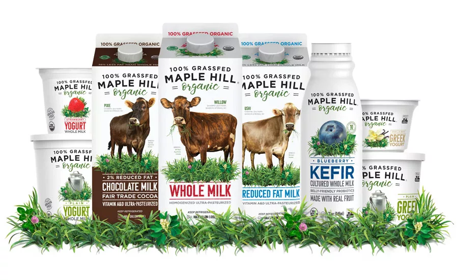
The central piece of the Maple Hill brand refresh was a true-to-life custom-photographed bed of grass, which the OffWhite team ensured was an actual representation of the fields the company’s cows graze on.
Now featured prominently in every brand asset, the bed accurately depicts blades of alfa, bluegrass, clover and goldenrod, underscoring the company’s authenticity and sending a clear message that this brand can be trusted. Gorgeous fruit and flavor imagery is nestled carefully into the grass bed for each distinct yogurt and kefir flavor.
When the milk line was introduced, OffWhite kept the same grass, but replaced the fruit imagery with portraits of actual Maple Hill cows photographed on location at the company’s various upstate New York farms. The branding now closely aligns with the artisanal quality and distinctiveness of the product line.
Be authentic and consumers will respond.
When Maple Hill decided to introduce milk to its line, OffWhite went the extra mile to help consumers feel a personal connection to the product — and the benefits of it coming from grass-fed cows — by including the cow’s name, backstory and farm location alongside each cow’s custom portrait as part of the new product icon.
Consumers have been shown to naturally gravitate to the adorable cow names — such as Pixie, Ushi and Willow — and feel comforted by knowing exactly where their milk is sourced. With 86% of consumers shown to prefer an authentic and honest brand, OffWhite knew that transparency is key.
Costly advertising isn’t always needed.
Studies show that consistently presented brands are 3.5 times more likely to command strong brand visibility. Maple Hill’s brand refresh is proof of that.
According to Joseph, the company’s phenomenal recent growth was achieved without incurring advertising spend beyond normal in-store retail promotions. The secret sauce is the company’s new look and messaging, which is succeeding in generating appetite appeal and a stronger shelf presence.
Maple Hill’s rebrand embodies transparency, consistency and sophistication — all hallmarks of good design — helping to propel the company to the top of its industry with all-new products easily slotted into its unified brand asset system. It’s not surprising that post-launch, consumer focus groups reported an 80% purchase-intent rating, with a high percentage saying they would definitely buy the product. As a result, not only is the grass greener for Maple Hill today, but it’s also greener for consumers, who are benefitting from the grass-fed, organic benefits of its product line.
Josh White is principal and creative director of New York-based brand and design agency, OffWhite Co. With more than two decades of experience transforming some of the world’s most successful consumer product companies through the intersection of brand strategy, creative product development, innovative packaging and technology, White’s award-winning holistic creative systems have played a key role in reinventing brands and helping clients find the secret sauce to advance their companies to the next level.
Looking for a reprint of this article?
From high-res PDFs to custom plaques, order your copy today!


