Add a natural hue to dairy products
As processors gravitate toward natural colors, they should keep in mind certain pitfalls of using these clean-label ingredients.

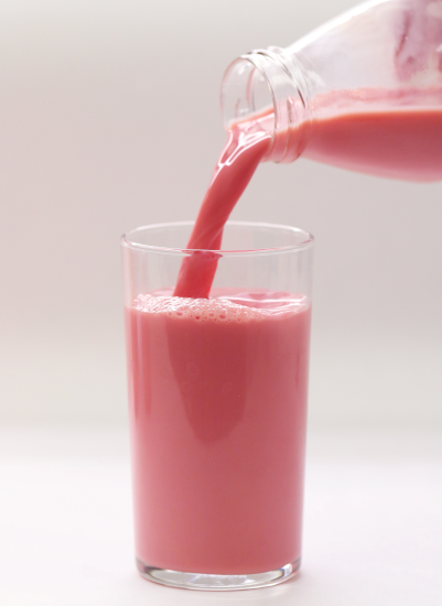
Photo courtesy of DDW, The Color House
Watch any major reality cooking show and you’ll notice that one of the main criteria that makes or breaks a winning dish is presentation. And in dairy, color is top in processors’ toolkits to create visually appealing products.
“We eat first with our eyes, and Sensient’s consumer research consistently shows that improved color correlates to improved flavor perception and purchase intent — driving sales and repeat purchases,” notes Meghan Fox, marketing specialist for Sensient Flavors and Extracts, Milwaukee.
But not all colors are created equal. Today’s consumers are looking for products that not only are visually appealing, but also are clean-label-friendly. Enter: the popularity of natural colors.
“The main request we’ve seen from dairy processors are for colors that meet consumer demand such as colors derived from natural sources that consumers may perceive as ‘better for you,’ colors that complement trending flavors and colors that have a simple label,” says Jody Renner-Nantz, Americas applications manager for DDW, The Color House, Louisville, Ky.
Processors who opt for a natural color solution will still have to meet consumer expectations for bright, stable hues in dairy products. But by avoiding certain pitfalls, they can ensure top color performance.
“Consumers are no longer satisfied with either natural or delicious/visually appealing,” Fox says. “They want it all in one product: natural, better-for-you, delicious, flavorful, visually appealing, colorful, interesting, and delightful.”
Why natural?
According to Emina Goodman, senior director, commercial color development for Chicago-based ADM, as consumers gravitate toward healthier products, many are avoiding those with ingredients seen as artificial, including artificial colors.
“Research also shows that over 60% of consumers actively avoid artificial coloring in foods and beverages,” she points out. “Finding color sources that can meet both consumers’ desires and formulators’ needs is vital for dairy brands’ success.”

Jeannette O’Brien, vice president, GNT USA, Tarrytown, N.Y., points to an FMCG Gurus survey that found over 50% of consumers actually are willing to pay more for “natural” dairy products.
“Clean labels are becoming increasingly important to consumers, so it’s vital that brands use natural colors to maximize their products’ appeal,” she adds.
According to Fox, natural colors are now the “expectation, not the exception;” therefore, most ingredient suppliers are stepping up to meet this demand.
For its part, ADM helps processors meet clean-label needs with its Colors from Nature line, which is sourced from botanicals, vegetables, fruits, and spices and is acid- and heat-stable.
“They stay brilliant throughout different processing conditions and shelf life, helping dairy formulators create beautiful and intriguing offerings,” Goodman says.
Hørsholm, Denmark-based Oterra — formerly Chr. Hansen Natural Colors — also offers a line of colors suited for clean-label needs. Its FruitMax portfolio can be labeled as fruit or vegetable juice on packaging, says Rachael Miller, dairy application scientist.
“Our FruitMax range is made from a wide variety of fruit, vegetable and plant concentrates,” she points out. “Minimally processed using gentle production methods, FruitMax colors can be clearly and simply labeled on ingredient lists and help you position your food and beverage products as healthy and less processed.”
GNT’s Exberry line of natural colors also is made from edible fruit, vegetables, and plants. According to O’Brien, they are produced with “physical processing methods” and do not use chemical solvents — further adding to clean-label appeal.
“They can also be described on the label in a way that’s easy to understand such as ‘colored with carrot juice’ or ‘fruit and vegetable juice (for color),’” she says.
Meet specific coloring needs
Not all colors are easy to convert to clean-label options. For example, white is a crucial shade in dairy products, notes Goodman, as it can communicate a dairy product’s healthfulness and freshness.
“Plus, research shows that 57% of consumers associate white with products that support bone and joint health, which appeals to consumers’ wellness demands,” she adds.
However, white coloring can be challenging from a clean-label perspective. Many of the options currently on the market don’t offer excellent stability or performance in dairy products, Goodman says.
“For instance, rice starch, modified starch, and calcium carbonate have a wide range of drawbacks, including substandard vibrancy, stability, and consistency,” she adds.
To address this gap, ADM recently launched a line of white color solutions that meet both clean-label and performance needs.
Blue shades are trending in dairy products. A blue hue — Very Peri — actually won Pantone Color Institute’s 2022 Color of the Year; the institute suggested the color “points to ‘transformative times’ and encourages ‘courageous creativity,’” Goodman explains.
However, stable blue is a very difficult shade to achieve in a nonartificial way. ADM offers a solution here, notes Goodman. It recently launched a patented acid-, light- and heat-stable blue made from the juice of Amazonian huito fruit.
“Our fruit juice blue helps dairy processors achieve a range of eye-catching shades, including blue, purple, green, and brown — all sourced from nature,” she notes. “Even in low-pH applications such as yogurts, shades created with our fruit juice blue stay true and consistent because they can endure pasteurization through ultra-high-temperature or high-temperature/short-time systems.”
Sensient also added a natural line of cool colors with its newly FDA-approved Butterfly Pea Flower extract, Sirsoky says. The ingredient line can be used in “dairy and non-dairy drinks, ice cream, frozen desserts, smoothies, fruit preparations in yogurt, nutritional beverages, liquid coffee creamers and more.”
Butterfly Pea Flower extract also is heat- and light-stable, she points out.
“Butterfly Pea Flower Extract adds deep blues, as well as healthy greens and rich purples through blends, to the dairy developer’s toolbox,” Sirsoky adds.
And orange and yellows are commonly used in dairy products, but some clean-label solutions available suffer from “pinkening” issues — meaning the orange fades to pink over the course of the shelf life, says Goodman.
“Annatto-based colors help tick this box, and our vibrant annatto color solutions solve for stability challenges,” she adds.
Avoid common coloring mistakes
According to Renner-Nantz, processors should be aware of the challenges of using natural colors before transitioning to them. For example, such hues often fade during harsh processing or on the shelf.
“There are a lot of pitfalls people can run into when using natural colors. But it would be difficult for people who don’t specialize in natural colors to know all the ins and outs of every color,” she notes. “That’s why we’re here — to guide manufacturers on the best color to use with their applications.”
O’Brien agrees, noting that plant-based colors are not just a “plug-and-play solution” and require in-depth knowledge of how to use these ingredients.
“Manufacturers need to understand what the ingredients are, what comprises them, and where they are sourced from,” she points out.
One common issue O’Brien sees is when processors use ingredients that contain “carotenoid pigments from raw materials such as carrots pumpkins and paprika.”
“Such carotenoid-containing products provide turbid shades that benefit from a natural stabilizer in applications such as milkshakes to maintain homogenous color through the shelf life,” she says.
Speaking of stability, it’s one of the top things dairy processors struggle with when using natural colors. And it’s becoming even more crucial as dairy manufacturers release an increased number of extended-shelf-life products, says Alexandra Sirsoky, technical service manager, dairy for Sensient Flavors and Extracts.
“In order to support these launches, suppliers like Sensient need to offer colors that can hold up to this type of long-term storage,” she says. “Our technical team is able to support our customers in stability testing for these concerns and others to ensure the consumer experience is delightful throughout the shelf life.”
According to O’Brien, processors could take various steps to ensure color stability.
“These include adding the color at the latest possible point and cooling the product down as quickly as possible,” she says. “Color dosages may also need to be adjusted depending on the opacity and color of the original base.”
Because color stability can be affected by processing conditions, Sirsoky recommends that manufacturers test color ingredients through the heating process.
“Some natural colors — like our Watermelon-Rose — are designed to handle high-heat processing, whereas other solutions are not. A developer might find that the color they approved pre-processing looks very different post-processing,” she says. “Replicating the process as closely as possible on the bench during evaluation will help to prevent this mismatch from happening and ensure that you are satisfied with the end product.”
Oterra’s CapColors portfolio can also help with such stability issues. It offers “high color potency and superior stability through most processing steps,” explains Rachael Miller, dairy application scientist.
“It is also a great option for multi-layered products where color migration may be an issue,” she says.
Take a holistic approach
According to Goodman, a common mistake processors make when adding color is not thinking about the holistic formula of the product. Some color ingredients can interact poorly with flavors or functional ingredients present in the recipe. Dairy processors should work with their supplier partners to find coloring solutions that work with the whole formulation in mind.

“For example, beets make excellent options for extracting deep red chromophores for a yogurt or ice cream but can produce a bitter, earthy taste,” she points out. “By understanding this potential outcome, we preemptively solve the issue using our proprietary extraction technology, which removes undesirable flavor notes from the beet while maintaining the color for a delightfully vivid and tasty treat.”
Key to ensuring that colors work well in a formulation is paying attention to the order of ingredient addition, explains Renner-Nantz.
“For example, when coloring process cheese with annatto, the annatto should be added separately from emulsifying salts, acid whey, or flavor systems to avoid interactions and potential defects like pinking, color complexing with salts, and color insolubility,” he points out.
The use of emulsifiers can cause problems, especially if processors are planning to use emulsification systems for colors and flavors. If that is the case, the flavors and colors should be added separately to avoid “potential breaking of flavor and color emulsions and ringing of the color system,” Renner-Nantz notes.
“Emulsification systems for tropical flavors like mango and banana may be incompatible with color emulsions like beta-carotene or paprika colors,” she explains.
According to Brian Sethness, executive vice president of sales and marketing, Americas for Skokie, Ill.-based Sethness Roquette, switching up the way ingredients are added can be key to solving formulation issues.
“We have seen instances where changing the order of addition solves a problem like migration of the color into the water phase,” he points out.
Looking for a reprint of this article?
From high-res PDFs to custom plaques, order your copy today!


