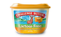
The packaging concepts showing up in dairy are becoming more competitive and innovative every day. Cheese, butter and cultured product makers are looking to grab more shelf space with compact packaging (that still holds the same amount) and easier-to-stack containers. Dessert processors are taking a cue from gelato and dessert shops and releasing clear packaging that shows off every swirl, chunk and color in its flavors. Even one new cottage cheese product is showing up with an innovative see-through container. Meanwhile, milk companies are finding ways to grab attention with unique shapes, colors and designs.
To see all the images of these new packaging innovations go here
Seeing is believing
Clear is in. Taking a page from the gelateria, which is known for its eye-catching displays of gelato you can see up close, some frozen dessert makers released new lines that are packaged in clear containers.
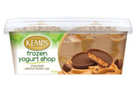
Englewood Cliffs, N.J. -based Unilever’s Breyers launched a Gelato Indulgences line last year in clear tubs. This year, Kemps, St. Paul, Minn., introduced Frozen Yogurt Shop, a line of frozen yogurt that is also packaged in a clear tub. The tub also features eye-catching graphics of ingredients, like caramel pouring onto chocolate.
According to Derek Scott, director of marketing at Kemps, transparent packaging is an emerging trend, something the company noted years back.
“Consumers told us that they like to be able to see what’s inside the package – what the actual product looks like,” Scott said. “They wanted to see if the product looked appetizing. And there was a perception of brands being ‘transparent,’ confident enough in the quality of their product to let the consumer see right through the package.”
Scott explained there were three key benefits of using clear packaging for its new frozen yogurt:
1. People “eat with their eyes.” If it looks like it tastes good, there’s a good chance it will.
2. Part of the experience of going to a frozen yogurt shop is to be able to put things in and on the yogurt. The more you add, the more visually appealing it is. Kemps’ goal was to bring that experience to the consumer’s home freezer. If they can’t see it, it’s not like being at the frozen yogurt shop.
3. The product visual through the container actually plays a critical role in the package design/ graphics. The design firm actually developed a design that allowed the product itself to be the primary, most visually arresting, design/communication element of the package.
See-through packaging isn’t just a dessert trend. It’s showing up in the cultured aisle as well. Artisa Fine Curd Cottage Cheese, created by Smith Dairy Products Co., Orrville, Ohio, was introduced in May. It’s a slow-cooked cottage cheese that has a fine-curd texture and fruit on the bottom. According to the company, it is unique to the industry because of its 5.3-ounce transparent single-serve cup.
Penny Baker, director of marketing at Smith Dairy, also noted that a recurring theme in the company’s research was that consumers like to see what’s in the package. Smith Dairy spent 18 months researching consumer attitudes and preferences on cup and lid styles, and participated in focus groups, all which contributed to the final design.
Artisa cottage cheese is sold at grocery stores throughout northeast and central Ohio. (See more information on Artisa)
Cheese makes room
Kraft Foods, Northfield, Ill., Crystal Farms, Minnetonka, Minn., and Sargento, Plymouth, Wis., are among the cheese companies that have switched to a space-saving stand-up pouch for shredded cheeses. The package holds the same amount of cheese (2 cups) but uses less actual packaging. A violator, or starburst, on the Kraft package states, “New package. Same amount of cheese, still 2 cups.”
Jody Moore, associate director, corporate affairs for Kraft Foods, said that the entire cheese category is shifting to this new size and style of pouch, with all of Kraft’s shredded varieties included. It has benefits for both the consumer and retailer.
“For retailers, it increases shelf space and allows for more varieties. For consumers, it conveniently stands up on counters and it also takes up less space in the fridge,” she said.
This change in packaging is likely being driven by retailers, said Robert Hogan, director of global business development and Asia for Zip-Pak, a maker of resealable packages.
“For retailers, a narrower package allows them more facings in the same space,” he said.
Also focusing on shelf space, Klondike Cheese Co., Monroe, Wis., redesigned the packaging for its Odyssey feta cheese in April. Along with an updated logo, the company moved from a round deli cup to a square cup.
“This is beneficial to the grocer for space on the shelves and it gives them the ability to display the cheese on different sides,” said Teena Buholzer, marketing director at Klondike Cheese. “It also allowed us to have more billboard space on the packaging to catch the eye of the consumer.”
Odyssey cheese is sold at Kroger, Kroger affiliates and other grocers. The new packaging hit stores in May.
Milk gets a new look
Take a look in the milk case and you’ll see milk is starting to show up in unique bottles and/or with eye-catching graphics. As the focus on milk shifts to its functional benefits, packaging for milk is starting to reflect that.
Chicago-based fairlife’s milk is packaged in uniquely shaped bottles (resembling an hourglass with ridges for easy grip), and features several call-outs to the milk’s benefits, plus bold graphics. The milk, which is lactose-free, has 50% more protein and calcium, and is lower in sugar.
Australia’s a2 Milk Co., which launched in the United States in April, features milk cartons with bold graphics emphasizing its unique benefits and calls out its “digestive advantage.”
According to Jim Smith, director of marketing for a2 Milk, the goal with the carton was to convey uniqueness, achieve maximum brand registration and tell the full story of its functional benefits. The carton features four panels of vibrant, full-color graphics, which helps to differentiate a2 Milk in the aisle and on the shelf.
For True Dairy Flavors, a division of Midpoint Enterprises, Hudson, Ohio, the emphasis was on the display of its milk on the shelf, and how to grab attention. The company introduced a new line of flavored milks in pints that resemble juice bottles.
“[When] all six flavors are placed side by side on a dairy shelf there’s a rainbow effect that makes them stand out from the surrounding white and chocolate milk products,” said Tom Matun, President of True Dairy Flavors.


