For dairy processors, product packaging is a key element and changes can make or break you. The design of the package can be the direct link to the consumer. It’s how the product is recognized and remembered. But changes can be necessary to keep up with trends and to help a product stand out or be more user-friendly.
PMMI, a packaging trade association in Reston, Va., surveyed its members about packaging trends. It found that the projected unit growth from 2011 to 2015 in total dairy packaging is 3.2 billion. PMMI reported that health and wellness drove up yogurt thin wall containers sales.
Dairy Foodsspoke with several dairy and beverage processors about recent changes made with their packaging. Some of the changes included a more efficient shape, bolder colors and fonts, and emphasis on ingredients.
Yogurt processors like packages with side compartments
For yogurt processors, a packaging trend that continues is the inclusion of a side compartment with mix-ins. Chobani, Norwich, N.Y., added a side compartment with its new Flip line, which includes mix-ins like fruit, honey, graham crackers and cereal. Wallaby Organic, American Canyon, Calif., created new nonfat and low-fat Greek yogurt lines with side mix-ins that include fruits and honey. Johnstown, N.Y.-based Fageis another Greek yogurt company that’s been using a side compartment with mix-ins.
Consumers lead Ruggles to a scrounds package for ice cream
Ruggles premium ice cream, produced by Smith Dairy Products Co., Orville, Ohio, recently updated its ice cream packaging to a scround design. The new cartons are two-piece, rounded cartons that fit easily in freezer doors. The easy pop-off lid closes more tightly to keep the ice cream fresh, according to Penny Baker, director of marketing at Smith Dairy.
The new packaging also features a unique pattern and bright color scheme that tie in with the name of the flavor, which is printed in bold type on the front of the carton. The flavor description and photo of the actual ice cream appear on every package, and a quick response (QR) code is on the back panel of the carton. Here consumers can find entertaining and fictional stories about each flavor, and can upload their own Ruggles ice cream stories, photos or videos about their favorite flavors to win prizes in the “What’s your Ruggles Story?” section of the website.
“We always seek — and listen to — consumer input about our products,” said Baker. “We conducted several focus groups and monitored comments on our social media channels, and the top packaging request was an easily identifiable flavor name, followed by a description of what is in the carton.”
According to Baker, the goal with the packaging changes was to be responsive to its customers’ preferences and utilize the technology available (i.e. QR codes), to fully inform them about the product and allow them to be more interactive.
“Consumers are more conscious than ever about product ingredients, and they want to be able to quickly and easily read those ingredients,” said Baker.
Square butter package is more efficient at retail, in warehouse
Boulder Brands, Boulder, Colo., makers of Smart Balance and Earth Balance butter spreads, focused on a more efficient shape with its new square packaging. The company switched from a 4.5-inch diameter round tub to a 4-inch-wide square tub, which will allow grocers to put 60 units on the shelf in the same space that previously held 40, according to the company. With this move, Boulder Brands expects shelf efficiency to increase by 50% and warehouse efficiency to increase by up to 60%. The packaging changes hit grocery shelves in May.
“In addition to the desire to achieve a more efficient shape, we also wanted the new packaging to feature higher-quality imagery with more appetite appeal on the package,” said John Becker, executive vice president of Smart Balance Brand. “To achieve this, we shifted from dry offset printing to in-model labeling.”
New artwork highlights ice cream’s tropical flavors
Ramar Foods, producer of Magnolia ice cream products, Pittsburg, Calif., updated its packaging with new label artwork that focuses on personality.
“The new label artwork is a result of a yearlong process to understand what our customers love about our ice cream. What we learned is that our customers love that we are different. They love that we are an alternative to traditional flavors,” said PJ Quesada, vice president of marketing for RamarFoods.com. “Most ice cream packaging is similar primarily because there is so little space to work with on the front of the pint. We opted for a type-heavy approach because there is little of that in the marketplace, and it gave us the opportunity to be more fun and descriptive with our tropical flavors.”
The company offers unique, tropical flavors in its ice cream including Lychee, Purple Yam, Mango, Thai Tea and its newest flavor Avocado.
Quesada said the goal with the new packaging was to better communicate the fun the consumers have with their product. Just after the launch, the company saw an immediate spike in awareness from its new packaging of the natural ice cream and natural milk bars.
Gelato packages get new logo, typeface
Talenti Gelato & Sorbetto, Minneapolis, Minn., also focused on labeling for its new package design. Its classic clear jars have been re-branded with a new logo and typeface. The pints now feature a “smiling spoon” logo. The typeface has changed to look more playful and readable, and each flavor has been given an origination number to identify the growing lineup of products, when all can’t be represented in-store, according to Amber Hancock, marketing manager of Talenti. In addition, illustrations have also been assigned to each flavor and are strategically placed above the ingredient listings.
“Talenti avoids design and packaging trends. Staying true to our brand values is important and we tried to reflect that in the design work,” said Hancock. “We gave attention to every little detail, all the way down to the custom hand-illustrated font that sprinkles smiles within the word ‘Talenti’ on the front of our package, to play off our logo and tagline. We pay more attention to what our audience responds to, rather than other packaging trends within the industry.”
Basic black helps probiotic juice bottles stand out
On the beverage side, probiotic juice maker GoodBelly, Boulder, Colo., focused on bold colors — like black. Earlier this year the company updated its GoodBelly + products from a color sleeve to a predominantly black look. According to GoodBelly CEO Alan Murray, the sales skyrocketed immediately after the change, so the company decided to give its family-sized quarts a similar update.
“We were looking to simplify and clarify the product messaging, as well as to try and stand out more on the shelf with the latest changes,” said Murray. “As we see GoodBelly products being placed more and more in the juice aisle, we noticed that our vibrant, colorful approach that had been so successful in the dairy setting, was being somewhat drowned out by all the other colors in the juice setting. So in order to create a clear, identifiable GoodBelly brand block, we went for black.”
To help clarify the product message, the company also updated the word probiotics to be much larger on the front of the packaging. To help ease the transition to the dramatic color change, Murray said they informed their consumer fan base about the impending design change via newsletters and social media platforms.
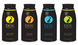
How we created a brand icon that stands out from the herd |
|
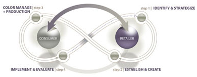
The ibex is a majestic animal known for its striking appearance, remarkable agility and vitality, and now it’s the image of Skyland Foods’ IBEX brand drinkable yogurt. These characteristics are the basis for the product and brand. The IBEX brand and product is the brainchild of Brandon Partridge, founder and CEO of Skyland Foods. Partridge believes that food should taste good, be functionally good for you and “cool” to buy at the same time. As a category, functional foods are increasing in popularity. And in an attempt to list every possible benefit to the consumer, marketers have created product packaging, which for the most part is type-heavy, overcrowded and over-packaged. When Strategia Design was briefed on the IBEX project we were given clear insight into the market demographics, target consumer, market gap analysis and desired positioning of the product. We understood that this product needed to live up to its name not just for what was in the bottle but for the actual product packaging, design and printing. Four Critical StepsAt Strategia Design we undergo a process for each and every brand for which we design and consult.
Step 1. Understand the marketing landscape. We analyze existing competitors and like items. We complete in-store and web-based audits, gathering sample and insights, looking for trends in both successes and failures. We work with our clients to understand both the immediate launch strategy and the essential long-term vision and growth plan of the brand. Step 2. The creative phase. For Skyland Foods we created a variety of different concepts that met the marketing need. We looked at SKU type, variety and flavors. We whole-heartedly believe that in addition to a design looking good it must print well. We believe that designs must be created from the start to accommodate the strengths and limitations of the final print method. Skyland wanted to use Flexo printed, full coverage, shrink sleeves instead of the traditional wrap label to help differentiate the product on shelf. The result was a range of designs concepts that would be simple, vibrant, highly impactful and print well. Our design process included a few rounds of revisions focused on refining the IBEX icon and creating a final design that embodied the strength, flexibility and vitality of the creature for which it was named. Step 3. The production phase. We worked with a variety of printers and packers to help source packaging, review capabilities and support Skyland Foods in their marketing efforts. An essential part of the product launch and ongoing success will be to work with the Skyland Foods team to ensure the continuity of the brand in every place that the consumer comes in contact with the brand. Step 4. Collateral material. We continue to help support the brand managers by working with them to develop marketing launch graphics, tradeshow booths, websites and sales materials and evaluate their effectiveness. The final packaging represents a bold and elegant brand image for this functional, delicious and healthy dairy product at a time when differentiation is essential in a category that is seeing tremendous growth and competition. Just like the ibex of its brand, this product will surely stand out among the herd.
— Deborah Ginsburg is the founder and CEO of Strategia Design, a certified woman-owned branding and design firm in Oakton, Va. With over 18 years of retail marketing and package design experience, Ginsburg is a sought after consultant and designer who has created and developed extensive programs for retailers and national brand consumer product companies. She has previously held the role of Director of Strategic Design for both HEB Grocery and Ahold USA and today brings a business perspective to what is traditionally an aesthetic endeavor. To learn more about Ginsburg and Strategia Design, visit www.strategiadesign.com. |