Dairy processors expect an awful lot from the packaging surrounding the foods they manufacture. Primary packaging must protect the product; show product benefits, ingredient statements and nutritional information; fit on retailers’ shelves and inside consumers’ refrigerators; be attractive and eye-catching; and be recyclable. That’s a tall order, but one that processors do not shy away from. They can’t, actually.
Health campaigns, such as the 2010 Dietary Guidelines for Americans, have cheesemakers making claims about reduced sodium levels on the package. Consumers’ interest in what’s in the foods they eat has ice cream makers touting their clean labels. Brand competition has dairy processors updating their packages to stand out in the dairy case. Sustainability initiatives have all food manufacturers looking for recyclable package materials.
The decision to redesign can be triggered by competitive activity, brand performance, internal goals and consumer behaviors, says Len Martinez, director of design and innovation for the cheese division at Kraft Foods, Northfield, Ill. Business was fine with the Philadelphia brand, but Kraft redesigned the package in part to address how the container was functioning on the shelf, Martinez says. Consumers were having trouble finding the flavors they wanted, he says, and Kraft wanted to increase the shelf impact.
Kraft changed its printing method from dry offset printing to the more expensive in-mold labeling printing process. The new process yields better rendition of photos and colors and allows for softer vignettes, more subtleties in the graphics and a more refined silver color (Philadelphia’s signature). With the in-mold labeling process, a label is applied to the cup and becomes embedded into the plastic, Martinez says.
Philadelphia has as many as 50 SKUs. The redesigned package helps consumers find the product easily on a retailer’s shelf and in their own refrigerators. A strawberry image, for example, is a visual identifier of the flavor. Inevitably, the fronts of packages are rotated away once the product is on a retailer’s shelf. By printing a strawberry image on both sides of the package, Kraft helps a shopper find the flavor he/she wants. (See photos on page 40.)
As silver is a signature color for the Philadelphia brand, burgundy is the signature of Sargento, Plymouth, Wis. The color conveys quality, a premium feel and other “positive emotions,” says Erin Price, director of marketing.
In response to comments from customers, the cheesemaker recently developed a stand-up box for its four flavors of string cheeses. The 18-count box contains and organizes the individual servings inside a consumer’s refrigerator. The box stands upright and is an alternative to 12-count flexible film pouches.
Rather than storing individual packages of string cheese in a refrigerator’s cheese drawer, the box makes the cheese more visible as family members look for snacks, Price says. She adds that retailers are selling more SKUs because of the package. A regional roll-out began in the fourth quarter of 2010 in the Southeast and moved to the Northeast and Midwest in January.

Anthony Caliendo is trying to build a consumer brand of cheese, and he’s counting on the packaging to help.
“If you are not innovating in packaging, you aren’t in the game,” he says.
Caliendo is the vice president of sales for JVM Sales, Linden, N.J., which is developing Milano into a consumer brand. JVM has been making cheese for private-label customers and for institutional customers. The company developed a 1-pound bag of Parmesan to respond to consumers seeking value. The pillow-type packaging offers more cheese for the money, he says. The company’s next step is to roll out a recloseable package with a zipper seal. That product will retail at a higher price point. JVM bought high-speed fillers for its bags and cups.
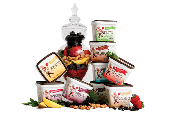
In the high-end ice cream category, two processors recently updated their packages for slightly different reasons. Santa Barbara, Calif.-based McConnell’s expanded beyond its home base to Southern California and needed a package design that quickly communicated its benefits. Gelato Classico, Concord, Calif., changed the color and shape of its gelato pints to stand out on grocers’ shelves.
McConnell’s general manager Scott Burns says a marketing study revealed that its customers did not know that the company does not use additives in the ice cream, only pure ingredients. A redesign of the graphics removed the image of the Mission Santa Barbara and replaced it with one of ice cream on a spoon. The imagery is intended to entice customers to pick up a pint, Burns said. Some local Santa Barbarans missed the picture of the mission, which had been on the packaging for 40 years. But that was the only negative feedback, Burns says.
After designing and printing the new packages, McConnell’s received kosher certification. That logo will be added later. The package includes the Real California seal from the California Milk Marketing Board, South San Francisco, Calif., and that has paid dividends, Burns says. The seal shows that McConnell’s is a local company, Burns says. Santa Barbara accounts for 33% of sales and Southern California for 60%. (The remainder is mostly in Northern California and Arizona.)
The CMMB funnels leads to McConnell’s. “If a retailer says ‘We want a California ice cream company,’ they refer them to us,” Burns says. “I wasn’t expecting that.”
After the new packages were printed, Burns thought of what he’d do differently. After a shopper told him she couldn’t see the names of the flavors when the product is on a high shelf, he realized he should have printed the flavor names on the banding around the lids. The company makes 37 flavors of 17% butterfat ice cream.
Gelato Classico changed to a cube-shaped pint package (actual dimensions 31/2 inches tall by 3¾ inches wide and 3¾ deep). The processor needed to buy a new filler for the shape.
“We wanted to stand out,” says Brandie Genibrel, sales and marketing director.
The old packaging was very brown and plain and looked like everyone else’s, she says. The dairy processor has been making gelato since 1976. It makes six flavors of gelato and three flavors of sorbets. It is also a co-packer of ice cream for another brand.
Gelato Classico added notes to the package about flavor profiles and what to pair the gelato with, much like a wine pairing. The package includes the CMAB logo and a statement that the processor uses milk free of rBST.
The processor also redesigned because it wanted a recyclable package, something the previous version was not.
“The containers are made from impact-resistant polypropylene,” says Mike Corrigan, who works for the packaging supplier based in Omaha, Neb. “The container and lid are in-mold labeled. Also noteworthy is the built-in tamper-deterring feature,” he says.
Processors of fluid milk and cultured products also are turning to sustainable materials for their packaging.
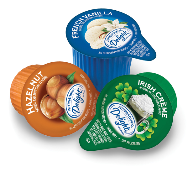
WhiteWave Foods, Broomfield, Colo., removed polyvinylidene chloride, or PVdC, from the packaging for its single-portion creamer products found in restaurants and grocery stores. By working with its vendors, WhiteWave says its research and development team developed a more “earth-friendly packaging solution” without affecting the product’s shelf-life. (Read more about the company’s sustainability efforts in this month’s “Inside Perspective” on page 86.)
Dallas-based Talenti Gelato e Sorbetto packages its product in #1 PET clear containers so that consumers can see ribbons, inclusions and colors, says CEO Josh Hochschuler. While the container can be recycled, it is frequently reused by consumers as a vase, cookie cutter, bait jar or food storage.
In May, Talenti announced it changed the jar’s screw-on lid to #2 high-density polyethylene. The material makes the lid less susceptible to cracking in extreme cold conditions. The lid, embossed with the company’s name, also has a more pronounced ring or lip, making it easier to stack on retailers’ shelves.
Dairy Management Inc., Rosemont, Ill., is working on a life-cycle analysis of packaging to help fluid-milk processors compare options. The study, expected to be completed this summer, is looking at the energy used in processing and packaging of fluid milk. DMI is taking into consideration the costs and use of raw materials, transportation, forming, in-plant processing and distribution. When that project is completed, DMI will have a calculator so that processors can plug their own data into the spreadsheet or use DMI’s set of average data.
“There is no one shade of green. It varies from pale to darker,” says Gail Barnes, a DMI vice president who is spearheading the project.
And it’s not right to compare a bulk package to a single serve, she says. “You must compare like to like.”
Canadian milk processors long ago switched to pouches made of low-density polyethylene. Just a handful of U.S. processors package milk in these containers, including Kwik Trip, La Crosse, Wis.
Milk in pouches has been the standard for more than 30 years in Canada, says Ken Hume, vice president of business development for Agropur’s Natrel division, based in Toronto. While milk in traditional containers is available, 76% of the white milk sold in the provinces of Ontario and Quebec is sold in 4-liter packages, says Greg Turcot, director of regional promotions.
Three 1.3-liter pouches (roughly one gallon) are sold together in a plastic bag. At home, the consumer places a pouch in a jug or container and snips off a corner of the plastic bag to pour the milk. In Europe and the United Kingdom, processors use pouches with a foot so the package can stand up on a table.
Retailers like the format because there are no returns, Hume says. Ontario province has a mandatory bottle-deposit law. Dairies like it because there are no bottles to clean. A drawback is the higher possibility of leaks compared to jugs, Hume says. In addition, the pouches must be hand placed into cases. The packing can’t be mechanized.
Kwik Trip has been using pouches since the 1980s, says Steve Wrobel in the company’s corporate communications department. Kwik Trip is a convenience-store chain in Wisconsin, Minnesota and Iowa (where it is known as Kwik Star) that processes its own milk, bottles juice and water, and makes frozen pizzas in its own bakery.
The company’s Nature’s Touch milk is sold in one half-gallon bags. It gives away a plastic pitcher for dispensing the milk. (Kwik Trip also bottles milk in conventional containers.)
Kwik Trip sells whole, 2%, 1%, skim and chocolate milk and orange juice in the pouches. Nine bags fill a dairy tote, which is placed on the bottom of convenience-store coolers. The packages are printed with the Nature’s Touch logo and are color-coded for flavor and fat content. Kwik Trip can price milk in pouches cheaper than in jugs because the bags are cheaper to produce.
Wrobel cites the sustainability features of pouches. One spool of plastic can create 4,300 half-gallon bags, he says. Three million bags can be created from one semi truckload of plastic compared to 18,000 plastic gallon containers on a similar truck.
American shoppers have tuned into eco-friendly and sustainability messages. Will more buy their milk in pouches? That remains to be seen. One thing is for certain: Processors will continue to refine the messages and images they print on dairy foods packaging.

